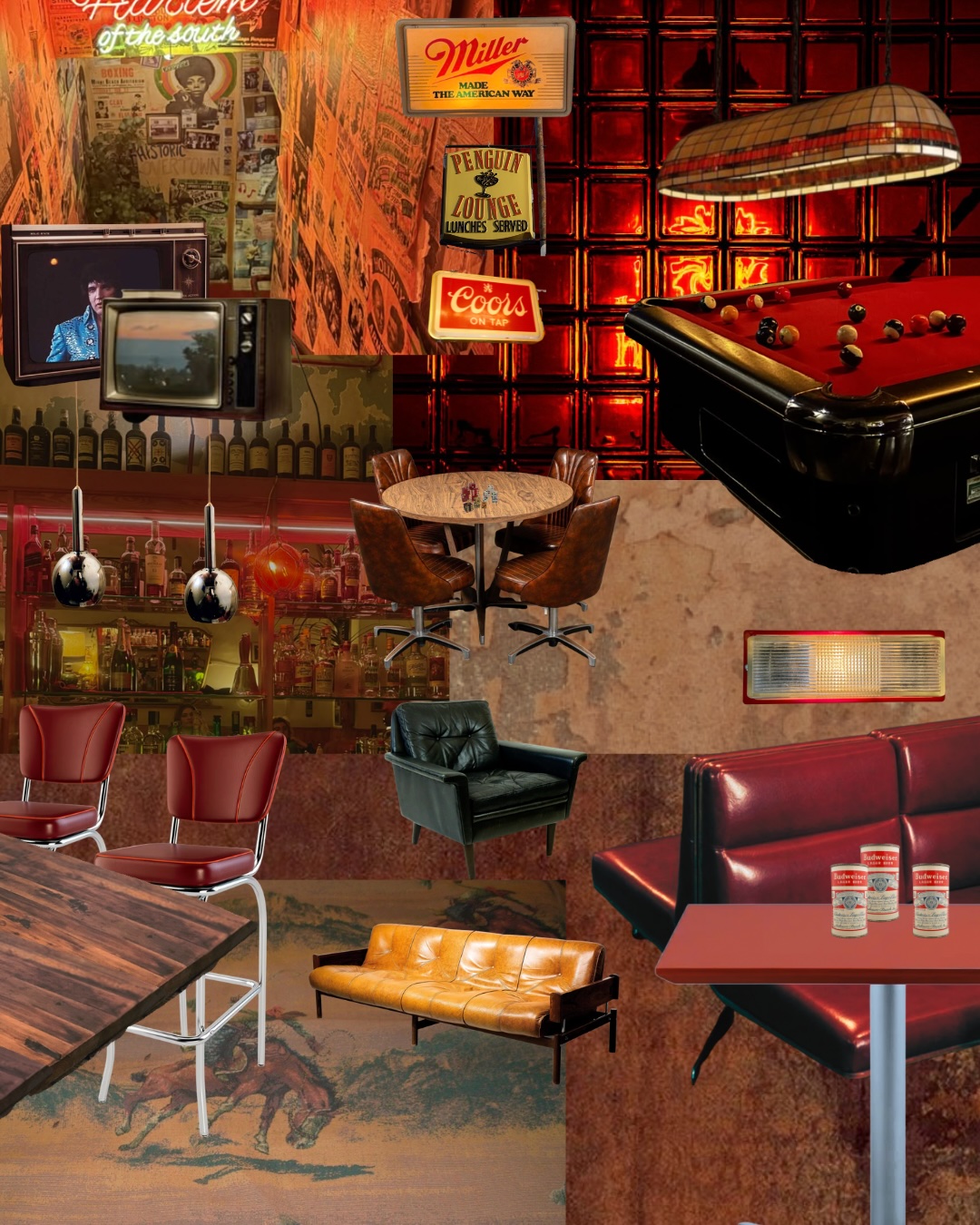
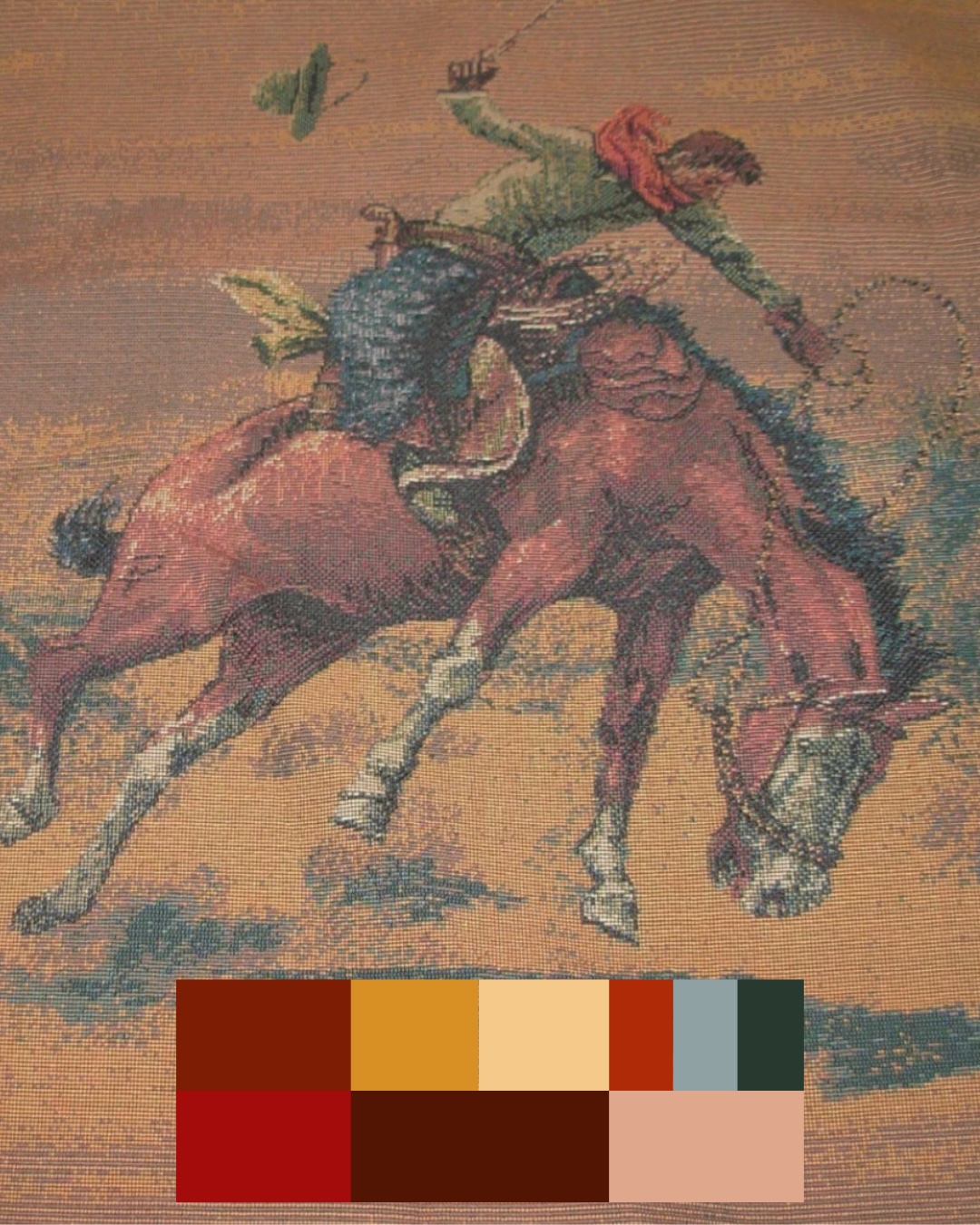
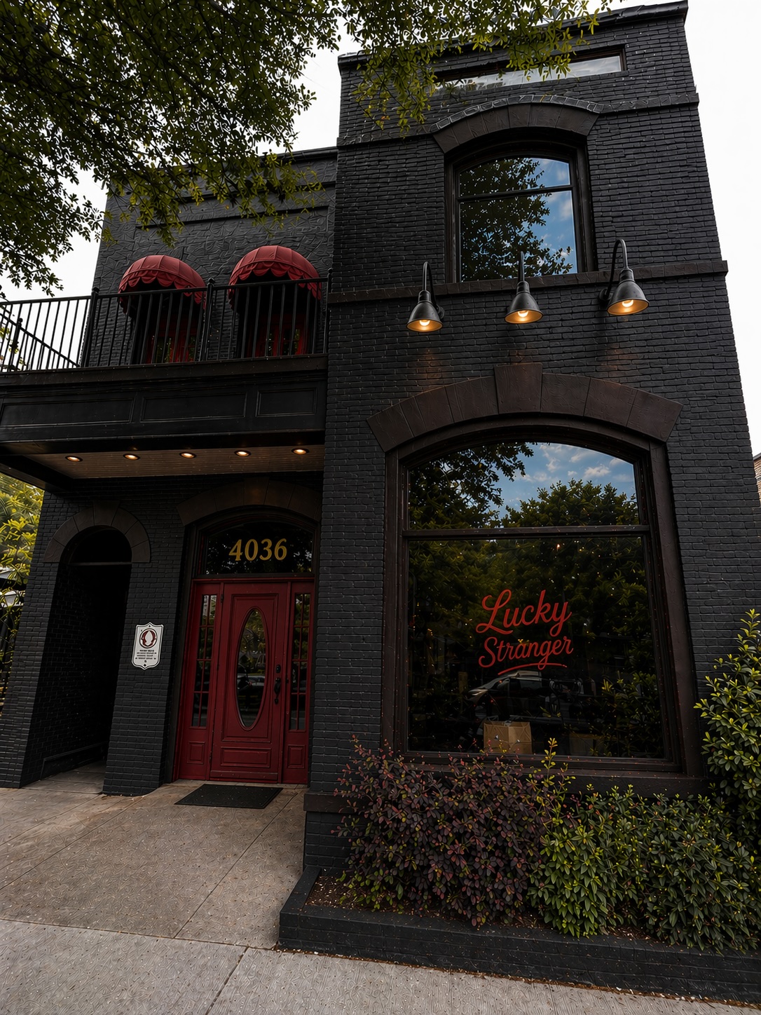
Everything you need to keep strong brand continuity is here: visuals to download, rules to follow, voice & tone and more. Not sure if you're doing it right? Reach out to Big Sis at erin@bigsiscreativestudio.com or jason@bigsiscreativestudio.com
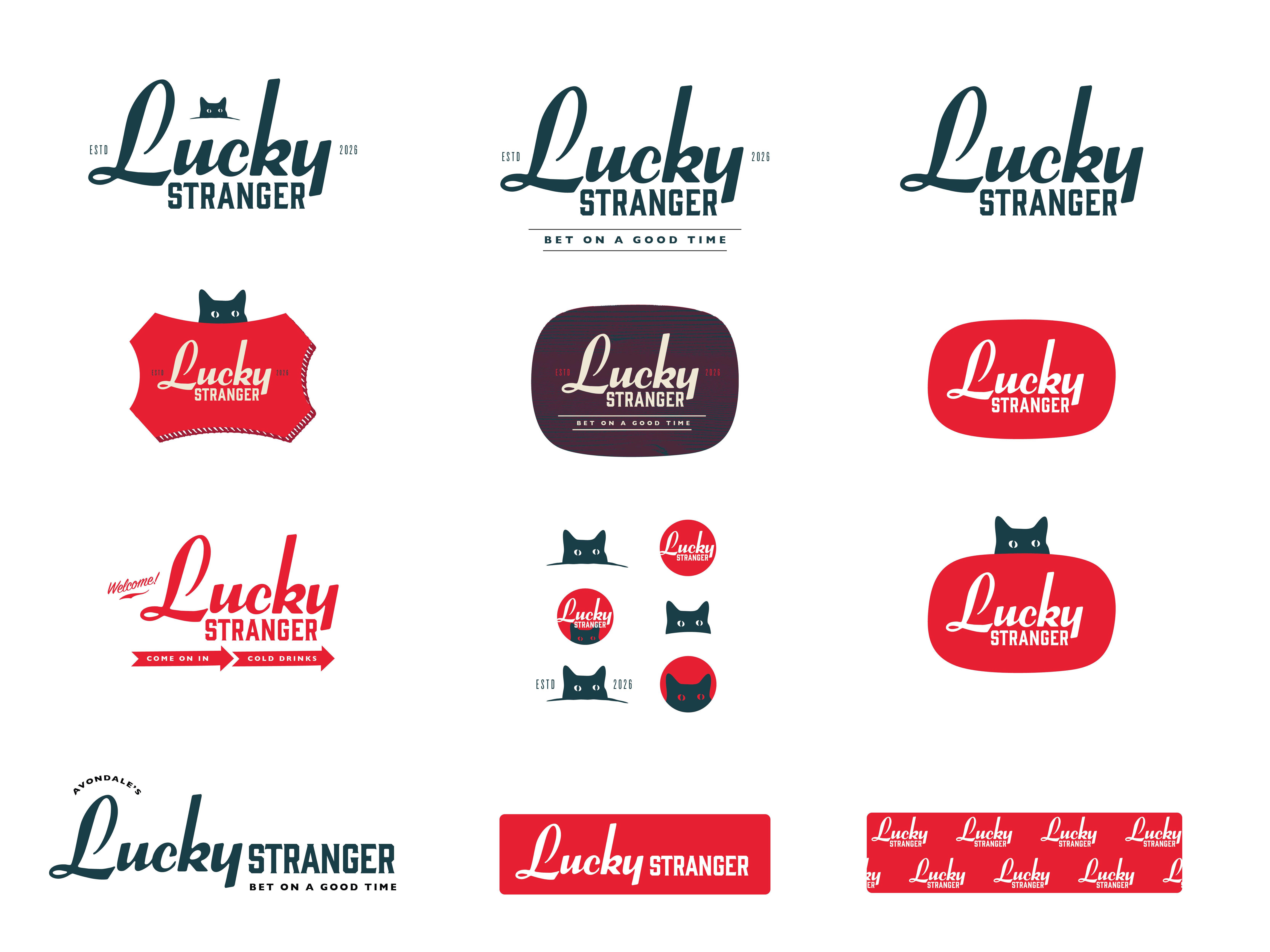
Grab what you need. All current, production-ready Lucky Stranger brand identity files can be accessed here.
Files are added here as they're finalized. If you need something specific before it's posted, reach out to Big Sis directly.
The foundation of the Lucky Stranger identity is the hero stacked wordmark. It allows for seamless integration of other visual elements, including Avondale's new favorite black cat. The system expands into extended lockups, horizontal layouts and badge formats. Use what fits the context, and avoid improvising.
→ Download the full logo package
The marquee script creates optical asymmetry. Use this diagram as your centering reference tool, because auto-centering tools will make the layout feel imbalanced.
The primary logo already has a horizontal shape, and should be used in most cases. These horizontal versions can be utilized when vertical space is extremely limited.
There are three peeking cat variations with multiple colorways, formats and eye treatments. They can be used as part of the wordmark lockup, or as an isolated mark when the context calls for it: favicons, social avatars, merch stamps, sticker applications, etc.
Five deep, warm, versatile colors that feel a little rough around the edges. The range intentionally aligns with the vibe of the space.
Lucky Strike
The lead. Signage, logo, dominant accents, hero applications.
Midnight
Primary dark ground. Dark backgrounds, footers, cat mark applications.
Cherry
Depth and richness. Extended logo lockups, accents alongside Lucky Strike.
Cigarette Smoke
Light ground. Paper, body backgrounds, reversed text on dark.
Bleach
Utility white. Contrast moments, reversed text, clean space.
From headlines and signage, down to menu copy and utility text, each of the four brand typefaces does a specific job.
Voice = personality, tone = mood. Lucky Stranger's voice doesn't change, but the tone shifts depending on the moment. The test: Does it sound like something that would actually be said at the bar? If not, pull it back.
Lucky Stranger sounds like a bartender who's seen everything and is genuinely glad to see you walk in. Matter-of-fact and welcoming, without being eager. Comfortable with whatever the day brings. The voice behind everything we write leans into the good time we promise — without having to promise it out loud.
| We are... | But not... |
|---|---|
| InvitingEveryone feels like a regular, even on night one. | Indifferent |
| UnderstatedEfficient and focused, without unnecessary fluff or try-hard energy. | Quiet |
| ConfidentStrong belief in ourselves, without trying to be cool. | Arrogant |
| OptimisticGood fortune is always on the horizon. We buy into that. | Naive |
| WryThere's a wink in there — sometimes more obvious than others. | Sarcastic |
| HonestWe mean what we say. Said respectfully. | Blunt |
Lucky Stranger's voice remains consistent, but there's a different tone in different rooms. How the message comes out depends on what the situation calls for.
Easy, approachable, a little playful. Not performing. Not pushing. Just the kind of thing you'd hear from someone who's at home behind that bar.
Confident and direct. No hard sell. Point toward the good time — let people decide to show up. The bar doesn't beg. It invites.
Hours, menus, signage — plain-spoken and utilitarian. No editorializing. The cleaner, the better. Trust that the brand context already does the talking.
A low-stakes invitation. Confident, warm, optimistic. Whatever the night has in store, you're in the right place to see what good fortune comes your way.
Wood paneling and Step-and-repeat are the two approved options to use as foundational backgrounds. Use these for print, digital, and environmental instead of off-brand textures or stock patterns.
Five different colorway options, each with their own personality. The goal: design a cup people want to steal.
Interior and exterior signage specifications and mockups. Developed in collaboration with Hannah on interior design. Files and approved proofs will live here as they're finalized.
Branded merchandise — apparel, accessories, print goods. Approved applications live here once production specs are locked.
Consolidated creative direction — "Lucky + Stranger." One logo direction, initial color system, font family recommendations, and early interior extensions. This presentation followed Presentation 01 (April 15) and incorporated client feedback on the two original concepts.
"We really like the hero being the 'Lucky' vs the 'Stranger' as the first option, however we like the look, feel, and creative direction & design system of the second one. We are hoping to kind of Frankenstein the two together if possible! Also we still love the second cat so hopefully we can keep the cat in there."
— Ali, Nan, Kelsey
Stenciled logos over found paintings. The cat mark on glass, walls, and signage. Brand as texture, not decoration.
Lock the logo, confirm color system, finalize font selections. Production-ready files once approved.
Language system to match the visual identity — how Lucky Stranger talks and what it says.
Interior and exterior signage development in collaboration with Hannah — grounded in the brand system and the actual space.
Once the core identity is locked, we turn to the sub-brand. LSD has its own visual register — that conversation starts here.
Two creative directions. One decision. The goal: align on which lane to push forward and build out into a full brand system.
Prepared by Big Sis Creative Studio · For Ali, Nan, Kelsey + Jose
Optimistic. Warm. Hand-painted. Utilitarian bones, dive bar DNA, a logo that looks like it's been above the door for twenty years and belongs there.
Mid-century refined. Quietly knowing. The person at the end of the bar who feels familiar, but you can't quite place. Intriguing, intentional. Mysterious in the best possible way.
Take a day or two. Let it settle. Gut reactions right after a presentation aren't always the final word.
Reactions on each direction — what resonated, what didn't, and any questions that came up.
Based on feedback, refine the chosen direction — tightening the logo, narrowing the tagline, beginning color and type.
Refined logo, selected tagline, color and type system, and a clear picture of what Lucky Stranger looks and sounds like going forward.
Once the core identity is locked — signage, fonts, colors, logo files, and the Lucky Stranger Disco sublabel.
Social profiles
Use these approved profile images for social platforms. They can be accessed through the downloads link.
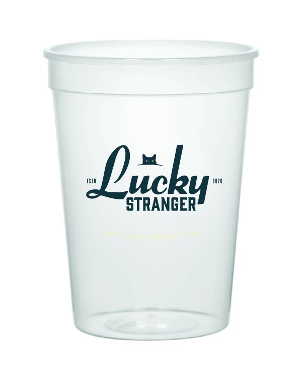
Primary — Solo Cat
Shows better as an avatar at smaller sizes and offers more personality for the page. Use on Instagram, TikTok, Facebook.
Secondary — Wordmark Square
For platforms that support rectangular or larger profile formats. Do not crop the full wordmark yourself.